Chart Explanation
Observation Rainfall
Data accumulated from observations entered into MyRAINge Log.
- Dashed blue lines represent comparison data but are still based on data entered in MyRAINge Log.
Estimated Rainfall

Estimated rainfall for the gauge location is extracted from a gridded statistical interpolation based on nearby weather stations.
- Dashed orange lines represent comparison data but are still based on gridded statistical interpolation data.
- Estimated data only available in reports.
Historical Average Rainfall

The reference precipitation climatology is created using distributions of daily cumulative precipitation for the past 30 years from the PRISM gridded dataset. The categories (very dry, dry, normal, wet, very wet) presented are the percentile ranks (2nd,16th,50th, 84th, 98th respectively) of cumulative precipitation for each day derived from the historical dataset from 1981 through the current year. More info on interpreting reference climatologies can be found here.
- Historical data only available in reports.
- Historical daily cumulative precipitation is not available on 02/29 during leap years.
Interpreting the start date and starting value
If the start date selected in the date range doesn't intersect with an observation point on the blue line, our system performs a simple calculation to determine the cumulative daily average between the start date and the first observation within the date range. This can be interpreted as a simple "zoom in" on the accumulating blue line. Take the following images for example:
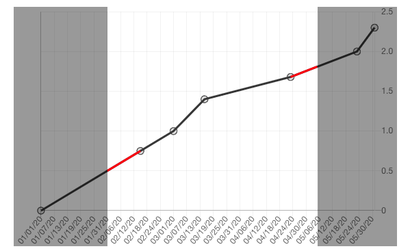
EXAMPLE 1
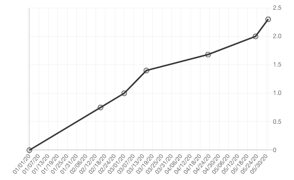
The start date for the chart in Example 1 intersects directly with an observation at the origin made on 01/01/2020, so no additional calculations are needed.
EXAMPLE 2
When the date is changed to 02/05/2020 - 05/05/2020, the chart is rerendered using those dates as outer bounds for the chart’s y-axis. The difference between the start date and the next observation is the cumulative daily average that our system calculates, represented by the red line in Example 2 (the red line is only for demonstration purposes only.) The same process is ran for the end date. This calculation is applied to any solid and dashed blue observation lines.
EXMAPLE 3
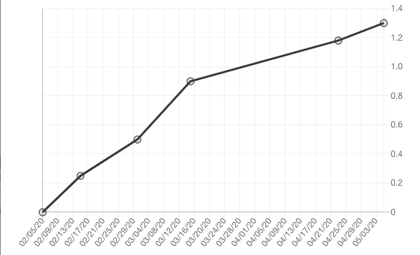
Example 3 is the final rendered chart with the new origin at 02/05/2020.
This ;explanation can also be found by clicking on the "Explain this Chart" link in the bottom right corner of any report.